Sitemap Development
The sitemap is the bird’s eye view diagram that shows the entire website. Not only does it account for all pages, it also shows how the pages relate to one another through a branching tree-like hierarchy.
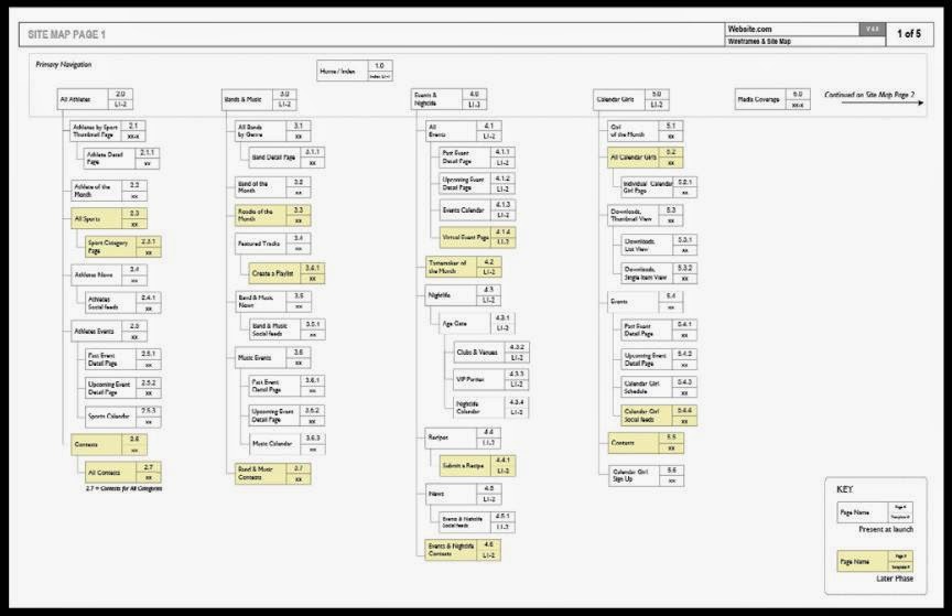
As above shows, sitemaps do not need to look fancy, they simply need to communicate the breath and structure of the site. Therefore, whatever software or online tool you feel comfortable with will suffice.
Sitemap tools
Information architects generally layout their sitemaps horizontally on an 11x17 tabloid, or A3 sized piece of paper. The more popular software tools used for producing sitemaps are Microsoft Visio, Omnigraffle, and even Adobe InDesign, but there are several online tools emerging such as Slickplan.com as well. Here’s a handy list of links:
• Slickplan.com
• Gliff y.com
• Omnigraffle
• Microsoft Visio
Since many sites are too big to fit on one sheet of paper, many information architects will focus on one site section at a time. For example, a large ecommerce store may have all the user registration and account management pages detailed on one page of the sitemap, and the purchasing checkout flow on another page.
Categorizing and prioritizing information
A key factor in building a user-friendly website is to prioritize information so that it’s not presented to the user all at once. You must anticipate what is important to most of your target user segments and give these elements the most prominent treatment.
I like to think of a website’s categories in three groups: what’s primary, what’s secondary, and what’s least important. For example, if you are building a restaurant website, you might elevate “Menu” and “Locations” as more important than “Our Story” and “Career Opportunities”. When building your sitemap, you can think of organizing your page groups in this manner: Generally speaking, your primary set of important categories becomes your primary navigation.

As you can see in above, this website’s primary navigation has seven elements. Clicking on each takes you to a “landing page” that is like an introduction for the section, and provides links to all the sub-pages contained within.
It’s important that your primary navigation set contains no more than 5–7 things to choose from. More than this amount can pose usability and visual design problems. These elements should also be related from a content perspective, and given the same visual treatment. For example, don’t include an “Investor Relations” link right alongside “Menu” and “Locations”. The latter two are very consumer-oriented while the first is only interesting to a select few and should also be related from a content perspective, and given the same visual treatment. For example, don’t include an “Investor Relations” link right alongside “Menu” and “Locations”. The latter two are very consumer-oriented while the first is only interesting to a select few and should probably reside in a tertiary navigation set.
Drawing and numbering pages on a sitemap
All sitemaps are represented as a hierarchical, upside down tree-like diagram. The “trunk” of the sitemap is always the Home or Index page. So, the easiest part of drawing a sitemap is putting a box at the very top of the page and calling it “Home”.
More importantly, the home page also starts the basis of your numbering scheme. All sitemaps number each page so that when you get into production, the team has a way of matching up wireframes, visual design files, and copy and content components to their correct page. Typically designers number the home page either 0.0 or 1.0. I personally like to use 0.0 for the home page.

As shown in above, any section that links off the home page is represented in the next row down and is numbered with an even 1.0, 2.0, 3.0 etc. Any pages that branch from one of these sections get a 1.1, 1.2, 1.3 numbering scheme. If you were to go further into the tree, pages are numbered as 1.1.1, 1.1.2, 1.1.3 and so on.
Designing a balanced site
The last nuance to building a good sitemap is balance. Take a look at the three sitemap examples in image below. All three sitemaps have 20 pages not including the home page.

In example above, there are 10 main sections! That means that the navigation on every page would have a whopping 10 items to choose from. This many choices can overwhelm the user leading to a bad user experience. And, as you can see in example A, there’s not much content loaded underneath each of these 10 choices, so this is what we call a very flattened hierarchy - everything is bubbled up on the surface of the site.

In contrast, example B has just three choices for the user. It’s ok to have just three choices, but look how deep Section 2 goes. If it weren’t for Section 2 diving down four levels deep from the home page, this wouldn’t be the worst structure.
From a usability standpoint, it’s best to limit a site’s depth to three levels if you can. In these diagrams all of the even numbered 1.0, 2.0, 3.0 etc. are considered Level 1. The pages numbered 2.1 or 3.3 represent Level 2. The three digit numbers are Level 3. When a site goes too deep like example B shows, it is difficult to offer navigation tools that help users back out of the bottom section.

Example C is the most balanced of the three. With just 6 main navigation choices on the home page, users are not overwhelmed. Each section has about the same amount of content, and it goes no more than three levels deep.
Go Back - Web Design Information Architecture - Part 1
No comments:
Post a Comment